Philips approached Matrix MCI with a new marketing strategy for AVENT in their most important channel: Babies ‘R’ Us. They wanted to test the concept of a branded section organized by baby’s age in two stores across Ontario and Quebec, but had no idea how this section would look and how to make it effective.
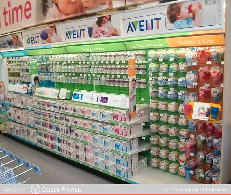
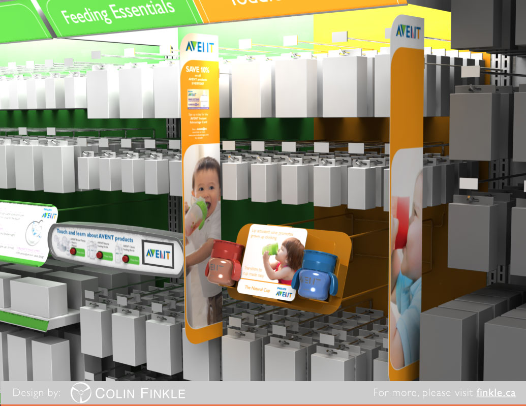
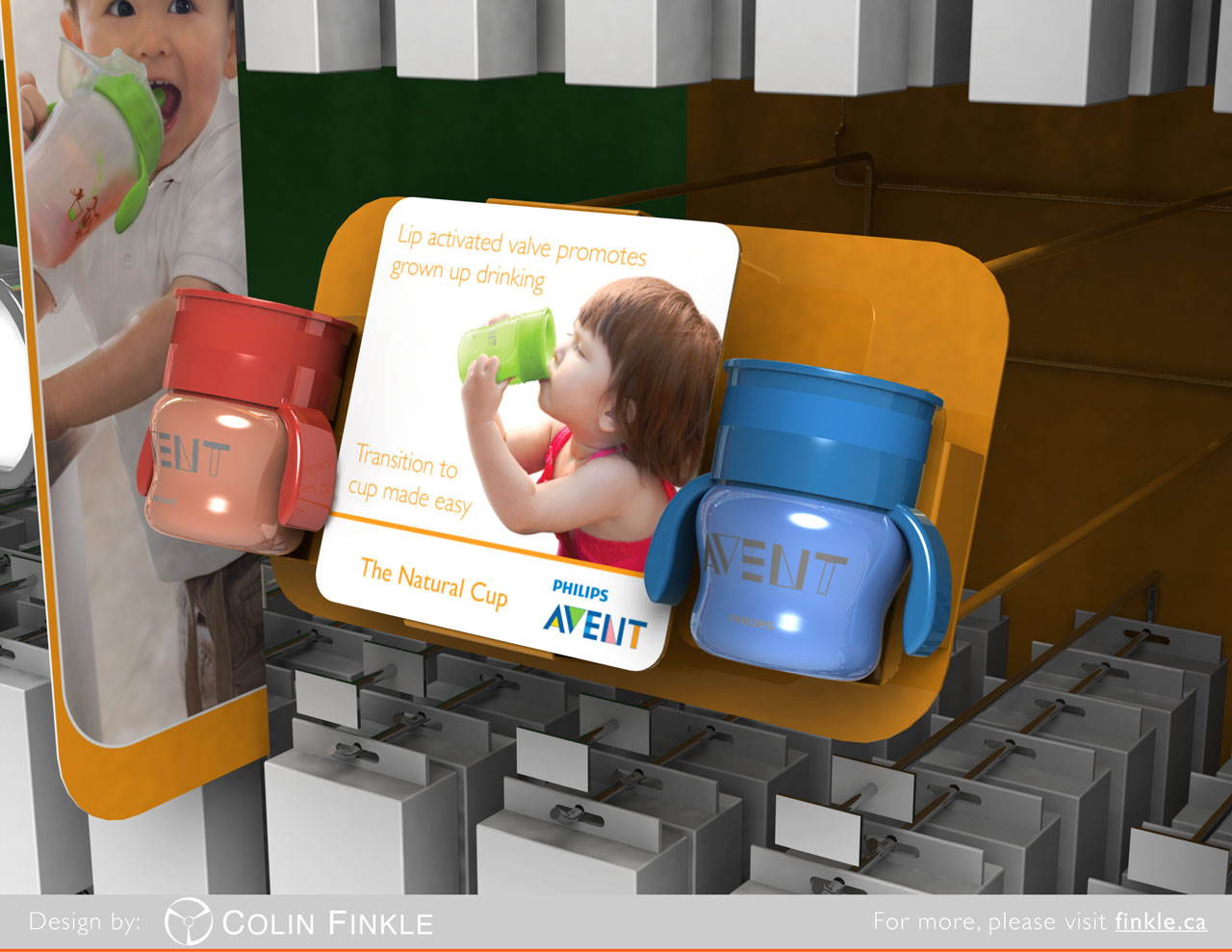
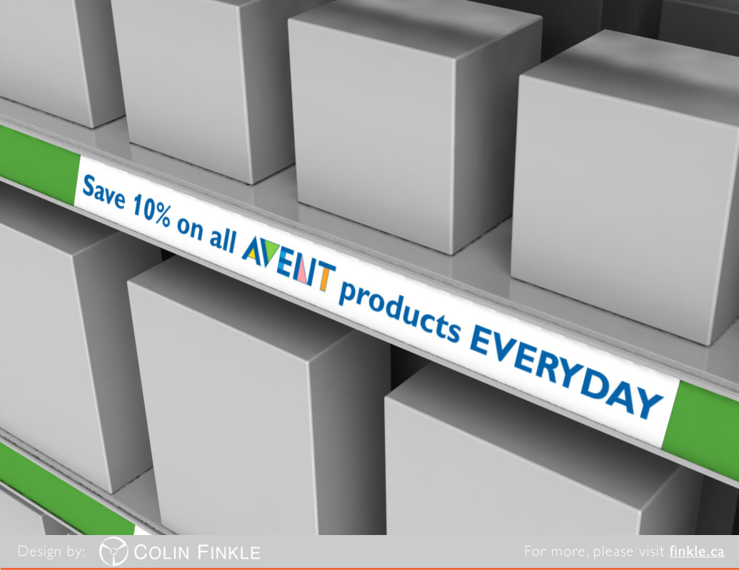
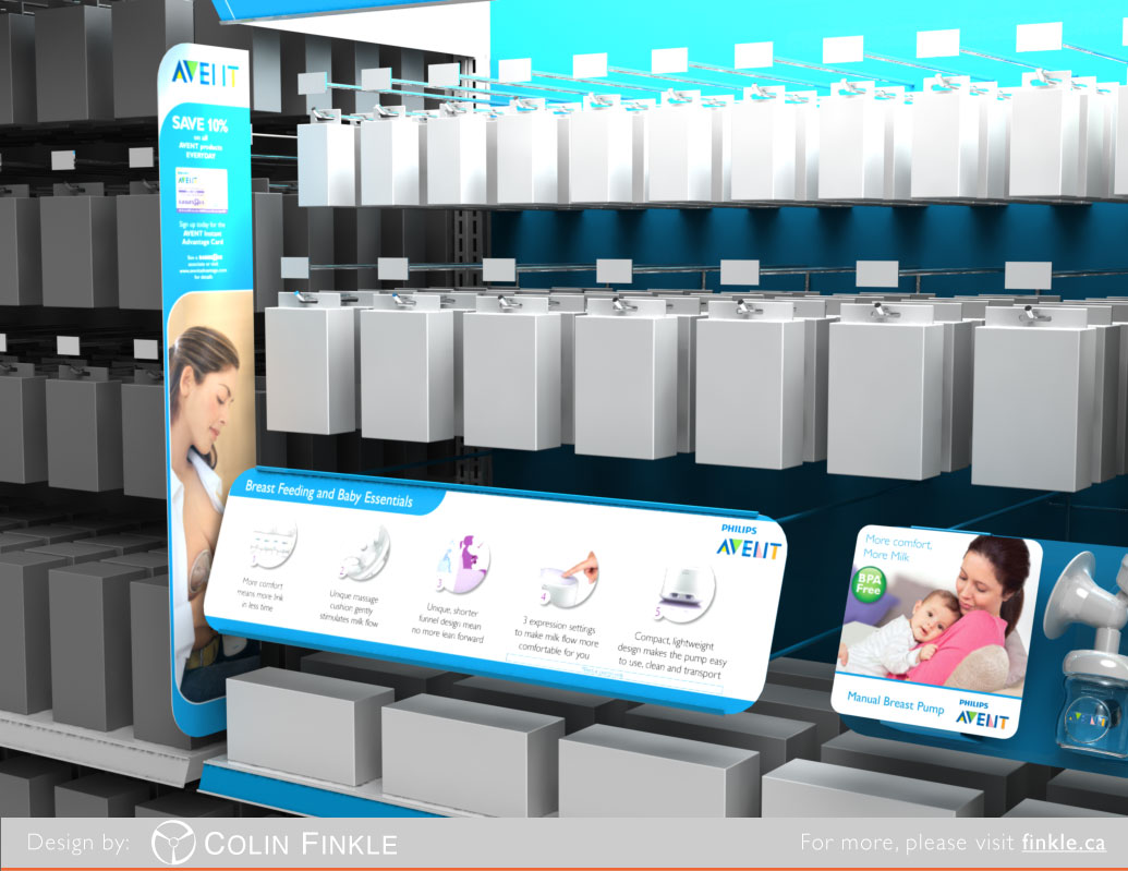
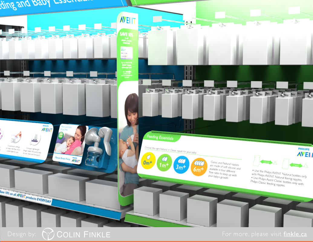
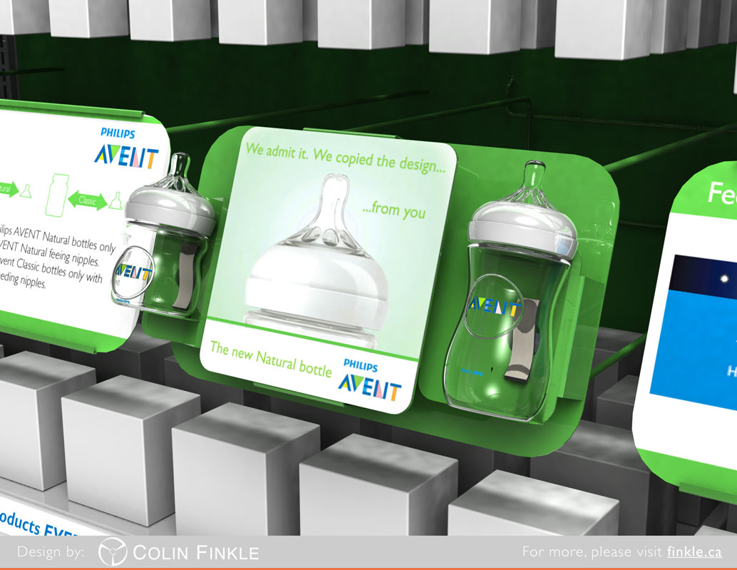
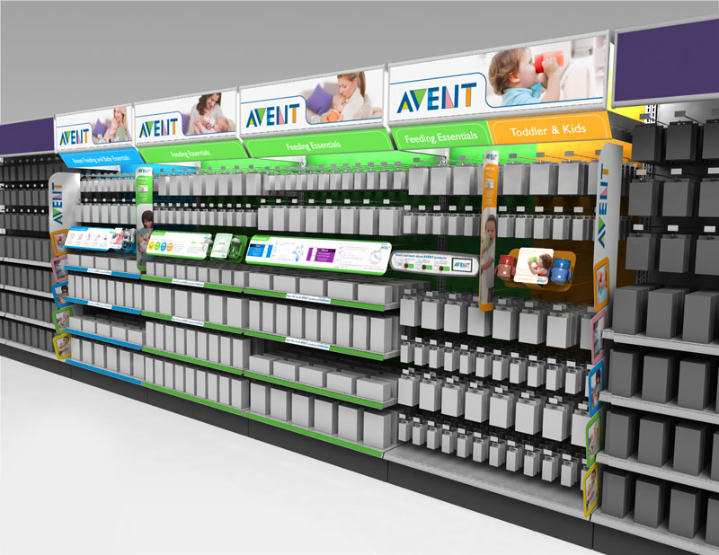
I started to think about, pencil in hand. I imagined the parent brand, Philips AVENT, overarching the section. I then envisioned a mother or father walking down the aisle, sequentially passing all the ages of products until he or she arrives at the products for his or her little one’s age. He or she would need to easily be able to determine where each section began and end. The AVENT brand’s elegant use of all sorts of colours gave a clear opportunity to delineate the sections. I imagined using three out of the five colours of the AVENT logo: blue, green and orange. I sketched every tool I could think of to introduce these colours: section headers, aisle blades, pegboard backing, and shelf strips. Touch and learn units were something we had done previously for Philips baby products and shavers; Philips wanted to see those, so I imagined them powder coated the section colours as well. I placed into my sketches angled information panels beside the touch and learn units to create a nice transition down from the short pegged products to the deeper shelves.
I scanned in two of my sketches and coloured them in digitally and we presented those to Philips. They loved the thinking. They provided a planogram of the sections that allocated space for the headers and information panels.
The approved sketch had given me a direction, but there was still quite a bit to be designed: both industrial design and graphic design. I 3D modelled everything for the 16 foot section in Solidworks and designed the print files in Adobe Illustrator. It was quite a time investment, but allowed us to iterate with Philips and provide them perfect representation of what their section would look like in scale which helped them get the approvals they needed. It also allowed us to identify opportunities like using the existing BRU section lighting to illuminate translite section headers, and placing large aisle blades on the ends to cap the section.
Once Matrix had the green light on the section design from both Philips and Babies ‘R’ Us parent company Toys ‘R’ Us, I outputted final print files with die lines. I worked with the project management team to determine what stock hardware could be leveraged to save costs. I made technical drawings to outline the custom components for metal manufacturing. I approved all pieces after they were printed or manufactured, and Matrix then installed the sections in their two test stores.
This was a large and very successful project, and would not be able to be done without the administrative help of Dianne Mills, and Shiva Katwaroo.
© 2013 matrix marketing concepts inc. All rights reserved.
