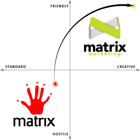
Matrix Marketing embarked on a process to rebrand the company early in 2015 to strategically position against our competition and to solve some perception issues with our legacy brand.
Matrix’s previous logo was a hand print with dots over each finger. It was clear to me that this was holding us back from sales, and not reflecting our values and the value of our service. The hand implied: “keep away!”
I performed and presented a competitive review, and our competition was focused on vertical integration. My proposition was to strategically differentiate Matrix as having superior customer service. This was based upon getting to know our customers and their needs; the marketing managers and merchandising people we work with value a company that could execute projects without taking a lot of their time. This allows them to take on more projects and get more results for their company. There was no way the legacy logo was positioning us that way.
The process started with the competitive review, identifying the key differentiator, and agreeing on a list of descriptors. The descriptors ended up being: friendly, trustworthy, and creative. If we could design a branding package that could be described as these things, the project was a success.

I looked at other business to business brands that were considered friendly, trustworthy and creative; Microsoft was a key one, and we looked at how they were achieving this in their branding. We identified things like bright colours, logos / icons with 1 colour shapes, and light fonts.
My design team and I created a first round of concepts with these lessons. These initial concepts did not win over key decision makers; they wanted to keep the hand. To respond, we earnestly designed the best logo concepts with a hand theme, but it was just not presenting the way we wanted to be perceived. This was enough to convince the decision makers to abandon the hand, but it was clear we needed a process that would help people feel included and foster buy in. I hosted two brainstorming sessions back to back: the first determining descriptors for the company’s brand, and second to generate logo concepts. Everyone participated, and voted on their favourite concepts after the design team refined them.
Using the feedback from the staff, decision makers chose two logos. The design team created the entire brand around them: business cards, letter heads, website home pages, mugs and pens. This allowed the final decision makers to see the logo in context. We chose the most friendly, trustworthy and creative concept, which is what you see below. We used the concept for everything nearly exactly, but we still needed to design many pieces. We designed a brand book to align the team.
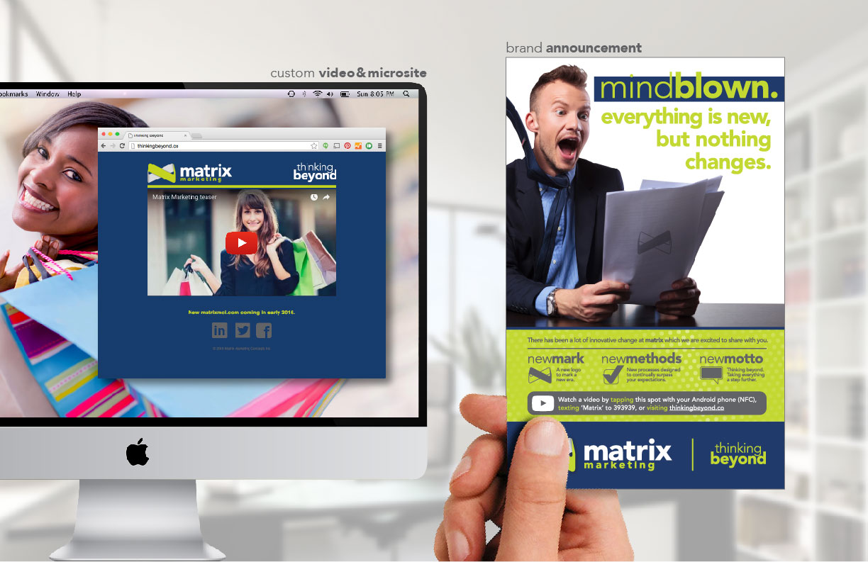
To announce the change to our clients, we sent our an announcement card with our Christmas card distribution. The announcement card used NFC and a short link to send people to an announcement video I produced. The Christmas cards also followed the new brand.
The team and I designed:
- CMYK logo
- RGB logo
- 1 colour logo
- Business cards (featuring embossment and spot gloss)
- Letter head
- White papers
- Excel templates
- Print standards
- Facebook fan page
- Linked In company page
- Twitter page
- YouTube channel
- Christmas card
- Brand announcement mailer
- Brand announcement video


© 2015 matrix marketing concepts inc. All rights reserved.

