Blog

  • How the eSports Logo Tournaments would have gone if I was judging it alone.

    How the eSports Logo Tournaments would have gone if I was judging it alone.

    You might have already read the eSports Logo Tournament on BMB Brand Marketing Blog. The response was tremendous and we are already planning more content because eSports branding is a hot topic right now.

    If you haven’t read it, we took the top eSports team logos and pitted them head to head in a round robin, then semi-finals, then finals. The winners of all of these “games” were chosen by a team of graphic designers as well as myself.

    Unfortunately, those pesky other designers… I mean gracious, giving designer friends(!)… eliminated some of the logos that I was really taken with. I am not upset, we had really great discussions about them and their point of view was valid, and it reminded me of the needs for multiple viewpoints because they were so different from my own.

    But I thought that I would share who would have won the tournament if I had scored it alone.


    Wings Gaming

    Bronze Medal

    The Wings Gaming logo is just interesting and well designed. It has a military vibe to it; like it could be the logo for a squadron of F-22s. The negative space W is a nice touch; this was a talented designer. I show it here in the original cyan, but it is now featuring an awful gradient, which is a big no-no for sports team logo designs because of printing / stitching on apparel.


    Astralis Gaming

    Silver Medal

    The Astralis Gaming logo is just such a simple and unique emblem. I can’t tell you how hard it is to find a unique geometry like this. The designer struck gold. A simple and unique logo like this will work in any context, but it really doesn’t look like a sports team logo, unlike our winner.


    Rogue eSports

    Gold Medal

    The Rogue eSports logo was the winner of the eSports Logo Tournament and would win again if it was just up to me. The illustration is technically well executed, the theme of the assassin works for an eSports team, and it is just a badass design. Does anyone know who was the designer?

  • Colin’s Opinions on the Smart Speaker Designs of 2018

    Colin’s Opinions on the Smart Speaker Designs of 2018

    Top Minds in Industrial Design Talk Smart Speakers

    I facilitated a group of the top industrial designers (Chadwick Harber, Nichole Rouillac, Grayson Byrd, Mika Becktor and Norio Fujikawa) to comment on the latest smart speaker designs.

    I chose smart speakers because the visual aesthetics are such an important part of the experience. These things are decorations as much as consumer electronics. While all of these designers acknowledge the paramount importance of usability of electronics like a smartwatch or a laptop, we don’t need to consider that to have a valid conversation about the designs.

    What you didn’t get are my opinions on the designs. So here we go:

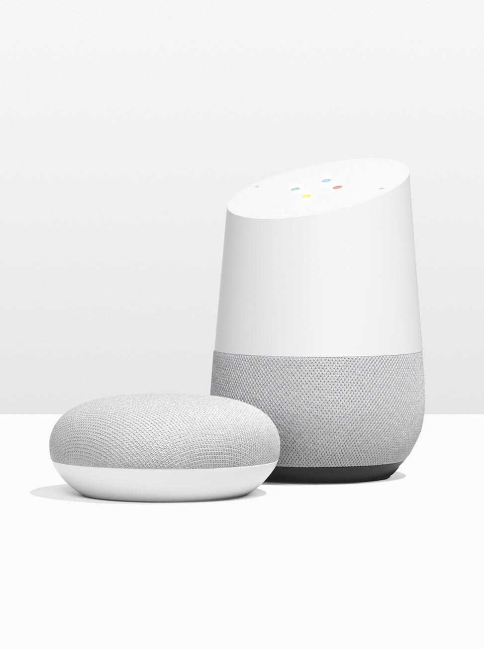
    Amazon Echo Plus and Amazon Echo Dot

    Bottom line: Let’s move away from cold and sterile.

    I appreciate that these are at a slight disadvantage, being the longest in the market without a refresh. But the designs do not project what they need to: approachability and style. There is nothing unexpected here and not a treasure you want to display in your home.

    The good news for Amazon is there are some clear directions they can go, and this article could give them the insight they need.


    Google Home and Google Home Mini

    Bottom line: My favourite.

    My preference is towards the Home, and less the Home Mini, but both are scuptural and appreciated the role of decoration the speaker has. The matte white plastic combined with the fabic gives the Home’s a comforting appearance.

    I own a Google Home Mini, but I would love to get a Google Home and display it prominently.


    Apple HomePod

    Bottom line: The engineers ruled the roost.

    Expectations are high when Apple enters a marketplace because they have a track record of designing things in a way that made all previous designs look silly. But that did not come true when they entered the smart speaker market. The design is on par with the best, but not a leap forward.

    It was clear when I was researching the story that they were focusing on the acoustic experience and the engineering that went into it. I feel as if the engineers arranged the speakers, and the designers just skinned it. I think of that as typical for a Dell or a Samsung, but you would expect a more integrated solution from Apple.


    Sonos One

    Bottom line: Where’s Waldo?

    I feel like the designers from silicon valley featured in the article knew something about Sonos: that they value blending into the environment. They shun the spotlight.

    That is a fine choice, and they succeeded at that. This speaker could go anywhere in any style room and barely be noticed. Finding the speakers in their press photos is almost a game of Where’s Waldo?

    But this is a bit of a lost opportunity. A smart speaker is different than a classic speaker because someone talks to it. While you do not need to face these speakers to use them, a lot of people address them with their body. They should have a presence.


    Harmon Kardon Invoke

    Bottom line: They designed a piece of consumer electronics when everyone was designing a houseware.

    Harman Kardon has a legacy of unique speakers designs with a lot of lateral thinking, which is why it is so surprising that they designed a speaker that looks very typical of a computer peripheral.

    No judgment; I might have designed it this way depending on the direction from executives.

    But the opportunity here was to design a nice home decoration that people would like to look at every day. This is design isn’t a feast fo


  • New writings on Brand Marketing Blog

    New writings on Brand Marketing Blog

    It has been a busy month for me on Brand Marketing Blog. I have been learning and sharing my knowledge of branding:

    Why Brand Marketing Works

    I reviewed why brand marketing works so effectively: we are biologically set to form reputations, relationships and associations from our evolution to survive. We use these same processes to guide purchasing decisions in the modern world.

    Review of Brand Seduction

    I read and reviewed Brand Seduction by Daryl Weber. This book talks about the science of branding and how neuroscience and psychology can help us make better decisions as marketers. I gave this book my highest recommendation.

    Changing business models with a brand.

    In this article, I review how Walmart wants to strategically realign their brand to focus more on online sales and purchased Jet.com to get them back into the race with Amazon for mass merchandise supremacy.

    Daryl Weber Interview

    I had a thoughtful chat with Daryl Weber, author of Brand Seduction, about how neuroscience and psychology can influence how we go about brand marketing.

    Definition of Brand Equity

    I defined brand equity and used Apple as an example of how brand equity is part of the value of a company’s market cap.

    The Compounding Effect of Brand

    In this article, I talk about how the primary effect of branding is compounded because positive brand associations lead to positive experiences, which strengthens those positive brand associations. It is a virtuous cycle. It can also go the other way where negative brand associations can lead to poor experiences, which is a negative brand spiral.

  • Brand Relationship Strategies article

    Most of the brands I work with are owned by companies that manage and distribute multiple brands. This means that they have chosen a strategy around how the brand relates to other brands and the parent company.

    David Aaker wrote an article on strategies companies can choose to best leverage their brand equity to sell products. I summarized his article, as well as adding a section of “associated brands.

    Read Brand Relationship Strategies on Brand Marketing Blog

  • All I ever needed to know about branding I learned from Superheroes

    All I ever needed to know about branding I learned from Superheroes

    Superheroes are anthropomorphized brands. For good sake they have logos on their chests! The Batman symbol (and sometimes the Superman crest) is consistently on the 20 more recognized symbols in the world. Superheroes have messages, followers, fans and they make money. They are brands. And they have it right! They are tapping into the human nature to crave behaviour changing information conveyed through dramatic storytelling. And they are forging relationships by meeting us as people through characters. Two things the best brands and advertising agencies only try to approximate. Now let’s take some lessons in branding from masters like Stan Lee, Grant Morrison, Christopher Nolan, and more:

    Superman debossed symbol

    Consistency in message

    Superheroes have been espousing the same messages for their entire “careers.” Justice for all. With great power comes great responsibility. An individual can make a difference. Sacrifice for the greater good. Fight for equality in the face of prejudice.

    We grew up with the messages. We learned these messages when we read, tuned in our, better yet, played as our favourite heroes. We lived these messages. These messages are all at the heart of the super hero brands we know. They are both their reason for being as well as what has sustained their longevity.

    It is because they’re consistent. We see so many companies that re-invent themselves in new business climates. We see so many advertising agencies change a brand’s message after winning a RFP. But these changes are not how to build a brand.

    Consistency in message is how to build a brand. It’s not sexy. It’s not glamorous. It doesn’t win awards. And it can give the false impression of being stale and boring (Superman’s brand had fought this perception, but endures.) Walmart and Batman may not have a lot of things in common, but they both have told their market / audience exactly what they are all about from day one.

    CFPortfolio_SuperheroSymbols_Spiderman

    Consistent graphics that freshen

    I always espouse that a bad looking brand used consistently is more effective than a good looking brand used inconsistently. But Superheroes change their costumes, and it’s heard to ask companies to not change their spandex as well. Styles change, tastes change, society changes. The people who are the superheroes change themselves! But you can bet that it is going to be 70% the same, and you know for sure that that symbol on their chests is going to stay the same.

    Let’s be clear here. Superheroes may change their costumes only once a decade, and companies should to. And even those changes are incremental; the costumes are still 70% of the same. Exactly like a companies brand, a superhero’s costume is his face to the world. Change it too much, and he / she will not be recognized. And if you loose recognition than you loose the relationships you had previously with the audience. Their have been some spectacular failures in superhero costumes that have been reverted back (the best and worst superhero costume changes). But in the comic world, reverting back is a couple of issues. In the business world, reverting back means millions of dollars in media, effort and opportunity cost. Stay consistent, but freshen with the times.

    CFPortfolio_SuperheroSymbols_Batman

    Have a story. Stories travel

    What planet did Superman come from? What was special about the spider that bit Spider-man? What type of street were Batman’s parents killed? I know you knew that the answers were Krypton, radioactive, and an alley.

    Why? Because humans relay information through storey, and we remember stories because of drama. You would be hard pressed to find someone on the street that hasn’t heard those stories after 60 to 75 years of comic books, TV shows, movies or from their friends on the schoolyard or in the office. And they have stayed consistent for over half a century.

    There would be no superheroes if their weren’t the human tendency to pass information through storey. Comics are far from the first and definitely won’t be the last to use this tendency. Greek myths are full of information, morals and lessons to live by, told through parable. Some are extremely deep. And, less that coincidentally, they have super human powers too.

    Why do we do this? All memory is emotional and there seems to be a hack to the long term memory to the brain through experiential (and spatial.) We are more likely to remember things when there is an emotion attached to it. For example, you may forget someone’s name, but if you embarrassingly have to ask for it again, you never will forget because their is an emotion attached to it. Also, our short term memory can hold 4-7 chunks of information at a time (this is why phone numbers are 7 digits, and broken up into 4 and 3 number chunks). Information needs to go through our short term memory to place things in our long term memory, but that goes out the window when dealing with experiences (and spaces). People can remember multiple shuffled decks of cards using this hack. If I tell you to remember the number 2371 and tell me tomorrow, you are going to struggle with it. But you will remember it quite easily if I have you imagine yourself walking down a hall and you pass Kate Upton holding 2 melons, president Obama juggling 3 balls, Superman burning the letter 7 in the wall with his heat vision, and Spiderman webbing up 1 crook. Same amount of information, 4 digits, but easier to remember. If this phenomenon interest you, look up the baker / Baker paradox.

    Superheroes tap into this memory hack by making the information they are trying to convey have emotion through drama. Thus, we have no trouble remembering things we have heard about them through their stories. If your brand has a story with even a little emotion to it, it will be much more memorable and it will travel faster than The Flash.

    CFPortfolio_SuperheroSymbols_X-Men

    People relate to brands as they do to people

    If you can understand this lesson, and the previous three will come naturally. People relate to brands in the same way as they do to people. They recognize them visually, they ascribe value, personality traits and emotions to them.

    We have evolved (or were designed, depending on your beliefs) to interact with other humans, not companies. As a species, we have spent more time doing commerce with people in markets rather than companies, and learning to use relationships to navigate who to work with or buy from was extremely adaptive. The entire reason for branding in the first place is to bring a company closer to a person so people can have a relationship with it. Very rarely do we form relationships to faceless commodity products. People want to have relationships with other people, which is why marketers are seeing more social media activities around their mascots than their brands. The comic companies are not immune to this either: Batman has 9.9M likes on Facebook, where DC comics as 1.2M and Iron Man has 15.4M likes where his parent Marvel Comics has 5.5M likes.

    If you think of your company as a person, you will have no trouble with branding. Why not picture your company as a superhero? What does his or her costume look like? That is your creative. And what is their personality? That is the tone of your copy. What actions is he or she trying to inspire out of society? That is your message. And finally, who is he or she? That is your brand. If you treat your brand like a person, than people will relate to it. Just as they relate to superheroes.

    I don’t know if I was attracted to superheroes because they had branding so right, our if I am so interested in brands because they are like superheroes. But either way, I still find them both fascinating. And you should to, because there are parallels and lessons to be drawn between each other. Remember, superheroes  are tapping into the human nature to crave behaviour changing information conveyed through dramatic storytelling and they are forging relationships by meeting us as people through characters. Do these things too and your brand will fly like Superman.

  • A Tale of Two Packages

    A Tale of Two Packages

    Awhile ago, two products entered my life in grand style. The two products have changed my life; I use them both independently nearly every day. The two products both greatly improved the experiences of the activities they facilitate. But most important for this blog post, the two products were excellently packaged.

    The two products were the Monster Beats Studio headphones and the Kindle e-book reader (6″, Fourth Generation).

    These are both very well designed products and are worthy of an entire blog post of praise for their industrial design. But that is not what I am going to talk about here. I was interested that the packaging experiences were so different, yet so effective in their own ways. Notice I say packaging experiences. The designers of these packages didn’t merely design packaging, but they designed the experience of un-boxing. But I talk about the packaging experience more in depth in another blog post.

    To be clear: I did not design either of these pieces of packaging. I am expressing my great respect and praise for whoever designed these pieces.

    Photo of the packaging for the Monster Beats headphones.

    The Kindle’s packaging and the Monster Beats packaging are very different. Clearly they have 2 different costs; the Beats packaging featuring alot of molded plastic and high end papers in order to reflect the premium nature of product it holds. The Kindle’s packaging also has molded plastic, but 1 piece and it is surrounded by raw (craft) corrugate. That corrugate highlights the next major difference, the channel. The Kindle’s packaging is wrapped in 1 colour printed raw corrugate because it gets to the customer through the mail. Even if they could invest in nice outer packaging, it would get dinged, scratched and battered in delivery. The Beats are delivered through the retail channel and are spared the rough treatment. But that also means that the packaging needs to looks like and convince customers on shelf beside it’s competitors. The Kindle’s packaging doesn’t need to compete for attention. Clearly the channel to the customer was a primary consideration in the design of each, and the difference in the 2 channels reflects the differences in the 2 packages.

    Even with the differences of the exteriors because of the channel, the interiors of both have similar considerations because the unboxing experience is important to both. Both make the packaging experience easy and have a clear sequence. Both products are easy to open. The Kindle has a tear away strip clearly highlighted on an angled front face. After you remove outer sleeve of the Monster Beats packaging, a magnets embedded in the laminated corrugate hold down the side you open first, which is highlighted by a fabric pull tab. Getting into the package is very easy in both cases.

    Once you are in both of the packaging, they reveal the contents in a clear, decisive sequence. The product is the first thing you reveal in both. The door swings up on the Amazon packaging revealing the device, and on the Monster packaging, the packaging opens right to left, and the 3 sides of the compartment with the headphones which stays stationary and catches your eye first. In both cases, the product is revealed; much like a magician reveals the end of his trick. You don’t watch the silk sheet being pulled away, your eye is fixed on the dove now in cage. I do have a criticism for Monster on this. The expensive headphones are zipped up in a carrying case, adding one more step to the packaging experience and lessening the reveal. The carrying case is a nice value add, but shouldn’t get in the way of the customers first experience with the product. Instead of a moulded foam case, maybe they could have a collapsible case that can be held under the product. The Kindle is presented face up, centred in a moulded paper tray. Simple, tidy and focuses on the core product.

    The Amazon Kindle packaging open

    The other piece being revealed in the sequence is the information booklets, cords and other peripherals. Both the Kindle and the Beats use the door that revels the product to hold the manuals. They both cover them up to hold them in, but also to make sure the product is the focus in the reveal. The Kindle packaging has compartment for the manual in the moulded paper that protects the product. A nice duel use. The Beats has it in a box with a door held down by a velcro dot and highlighted with a fabric pull tab. The Beats has it with the cords, batteries and adapters, where the Kindle puts the cord in another part, under the product. In both cases, the cords and peripherals don’t distract from the core product.

    The differences and similarities of these two products show the thoughtfulness that was given the packaging in both cases. They do a great job by considering four things: 1) the delivery channel to the customers, 2) the ease of getting in the packing, 4) the presentation of the core product, and 4) the sequence of the reveal of the core product before the peripherals. If everyone considered these things when designing or sourcing their packaging, we would have a lot better user experiences by getting off on the right foot.

  • Xbox 360 Elite design review

    Xbox 360 Elite design review

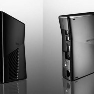
    Microsoft unveiled their new Xbox design at the 2010 E3 (Electronic Entertainment Expo), the gaming convention. The new hardware is packed with a 250 GB drive, and Wifi (a long time coming.) But what I want to focus on is what is on the outside. The old design was done by the industrial design / branding firm Astro Studios; a firm I am a fan of and take inspiration from. I don’t know if they deigned this case as well. Let’s analyze the industrial design:

    – This is clearly is under the same line of thinking as the Alienware hardware. Nothing wrong with that, particularly because Astro also did the design for Alienware. This is a strong difference from the pervious Xbox which was tidy and refined. The new design is more Mitsubishi Evo if the old design was an Audi.

    – Speaking of cars, the case design is like a car in that it has a belt line. A belt line design element on a car is the corner on the side that divides the sheetmetal pointing down from the metal pointed up; because above the belt line is reflecting the blight sky and below is reflecting the dim ground, it creates a high contrast line that can be used graphically on cars. This only works on shiny exteriors particularly using black, which the new Xbox case features. The line angles up to the back, and creates a nice graphic appeal to the otherwise boring side the the case. The fins and shape of the air intake on the right side reference the belt line, creating a dynamic yet tidy appearance.

    – The logo debossed on the sides of the case look too small, and out of place. On the right side it references the air intake, but on the left side there is nothing anchoring it to where it is positioned. It as a straight horizontal element looks awkward so close to the angles belt line. I would eliminate the logo altogether, or move it to the bottom or the top to reference horizontal lines.

    – The chrome button looks striking against the graphite colour of the case. But the brightness of the button drowns out the signature green-yellow glow around it. Maybe the glow is more prominant when you see the unit in person. I would like to have seen the green glow in more places, as it is the basis of the Xbox branding. It would have been nice to see the logo on the front of the case lit up.

    – The choice to switch from a light gray ro a grapite black is an interesting. They have had a black case before with the Xbox Elite, which was also a funny choice. With the original design, I credited Astro for have a very strong link between the branding and the case design. This black distances the branding and the product. It also moves it towards the look of their principle rival, the Playstation 3. This was change probably driven to distinctly distinguish the new model from the old one for marketing purposes.

    – The awkward hump on the top of the old case is eliminated… hallelujah. Let’s hope the overheating and red ring of death problems are gone as well.

    – The unit looks like it can still stand or sit on it’s side again. A nice feature to have. As nice as it would be to have people proudly display this in their living room standing up, I imagine it will be used on it’s side 90% of the time.

    – The case overall looks like they have designed some cost out of it, with only 1 finnish, has shallower injection molded parts and eliminated some parts. This is a good example of how a tidy, inexpensive design can look better if you understand your restraints and design a nice visual concept around them.

  • Borrowing Brand Associations

    I came across another company benefiting from the brand associations of another brand. We talked about this in regards to the Hyundai Genesis badge being similar to the Bentley, and Genesis benefiting from all of the luxury associations that come with positioning them selves closely with Bentley from a graphic standpoint.

    Well this one is cross industry. The logo for Heys luggage has the same old coat of arms design as Porsche.

    Porsche has the broader brand awareness, so Heys is the one that benefits by all the brand associations that come with having a logo similar to Porsche. Heys has pre existing associations like performance, high engineering, luxury and quality even before they run their first add. This is an amazing advantage, because Porsche had to spend hundreds of millions of dollars in advertising to earn those brand associations, and back it up with 60 years of quality products.

    This isn’t necessarily a bad thing. If you are building a brand, you need to capitalize on these associations so that you are getting a head start at building your brand to have those qualities with your customer. You don’t want to directly copy a logo, but to model your logo, graphics or architecture on that of other brands you want to be associated like in encouraged. But those associations are only stepping stones; if someone buys a Heys piece of luggage and doesn’t find the Porsche quality and performance, than they will quickly drop those associations they had. They will also feel duped or taken, and you will never recover them as a customer from that. Thankfully Heys makes very good bags.

    Unfortunately you take the good with the bad. Hey’s has the Lion crest very similar to the Peugeot one. Now Peugeot has a pour reputation for quality, and if Heys was in Europe they may see that brand association as well.

  • People adopt the personality of the brands they use

    People adopt the personality of the brands they use

    People have relationship with brands not only because of what they offer with their product or service, but also how being a part of that brand makes them feel. Brands that have strong personalities are the ones that capitalize on this. Whether this is the fun, playful, young-hearted Disney brand, or the macho, competitive, manly brand of UFC. People feel they have the personality traits of the brand they are using or affiliating themselves with.

    This was confirmed once again with a study from the Journal of Consumer Research (see this article for more details). In the study, participants were asked to walk a mall with the bright pink shopping bag of Victoria Secret. The control group was given a plain pink bag of a similar style. People with the Victoria Secret bag reported to feel more feminine, glamorous, and good-looking. In another study, people reported feeling more intelligent and like leaders when they used a pen with MIT engraving.

    This verifies what we already knew. What was a new discovery is that the personality adoption effect was greatest people who believe that their personality cannot be changed through their own self improvement efforts. People who believe that they have some control over their personality traits do not report personality changes from brands.

    People who feel their personality flexible would not see the need to use brands to augment their personality. These people wouldn’t see the value in fashion; they would feel that their attire would not have an effect on how they are perceived. They believe that if they want to change how they are perceived, they will work to change their personalities.

    It is a strange paradox: people who feel their personality is more fixed actually more flexible. But people with brands augmenting their personality probably feel like they are being perceived as having the brands personality traits, not as if their personalities actually have changed. People who feel their personality is fixed would be more exercised at using brands to change their personality or the perception of their personality at least.

    You may think this is tricking people who feel bad about their personal into buying products to feel better about themselves. Quite the opposite. The marketing to brand something with certain personality trait is adding value to the product itself. Helping people express themselves or feel better is an admirable goal.

  • Leveraging complimentary brand’s associations

    Leveraging complimentary brand’s associations

    You may have seen my Twitter post about the creative of the video for the Tom Tom iPhone app and car kit. What I liked about it was the associations it was creating between the Tom Tom brand and descriptors like urban, sophisticated, simple, worry free, elegant and future thinking. But then I realized why the associations were so powerful. The music, brand elements and the 3D road projected from the iPhone were inspired by a brand with all these associations powerfully built in for many people: Sim City.

    What was most clear to me was the music. I always liked the music from Sim City, and probably was a pivotal driver in my love for jazz. I often work to the Sim City Rush Hour soundtrack (free download) because it is stimulating but non-distracting. The ambient music in the Tom Tom iPhone demo video is very similar. I put the connection together consciously, but for most the association is there on an unconscious level. Players who played Sim City will link the positive feelings they remember from Sim City to Tom Tom, to a certain extent. A good move, because I would be willing to bet the people interested in the iPhone car kit would be on the geekier side of the general population (I am a self admitted geek) and are more likely to have played Sim City. Even if a potential customer hasn’t, Sim City did a great job of orchestrating those feelings and why try to reinvent their great work if they are making the associations you want.

    This can be done by any business. Think of a descriptor you would like your brand to be described as. What brand is best described that way? (Elegant = Mercedes, Free Spirited = Echo) Analyze that brand. What colours are they using? What sort of lines does the graphics have? What sounds do they use? How is the material composed? Look at everything that speaks to your descriptor. Don’t be afraid to integrate some of these aspects into the design of your company’s material. But put your brand’s spin on it, and give credit where credit is due.

    Check out the video for yourself. I think it is very well done:

  • First Design Blog Post

    Hello my friends and readers,

    This is the first post in the new blog section of my website. This section will be for my thoughts and lessons about design and marketing, and where they intersect: branding.

    Branding is one of my favourite topics to write about. I believe it is the single greatest benefit for a company from practicing good design. Branding is where a company can cash in the good will that comes from the good experience of using a well designed product; a user has to associate that good experience with a brand, and be able to recognize that brand the next time they make a purchase. In designing retail displays for great companies like Philips, Ubisoft, Bic and others, I help them convert on the positive experiences and relationship they have built with their users / customers. To use an industry term, cash in on their brand equity.

    Because I am so passionate about branding, I am going to migrate some of the more successful and helpful posts from my branding blog: FireBrand Creative. The first posts you see in this section will be from their, but everything else will be original content for Finkle.ca.

    Looking forward to talking to you more in 2012!

    Cheers,
    Colin Finkle

  • In Store Photo Blitz

    In Store Photo Blitz

    One of the nicest things about designing for the merchandising industry is seeing the fruits of your labour in store. Most of these pictures are from in store, but all of these (and many others) displays were mass produced. These were the displays I found in store and shot with my handy iPhone.

    Sony HD World was the first retail display that I worked on, and to this day one of the most interesting. I worked on this on my summer internship with Red Leaf Retail Concepts, and you can read more about it on it’s portfolio piece page. While this is photo is taken at a trade show, these made it out to over 200 stores, including The Sony Store which Red Leaf was trying to get into and was a real victory. I like to believe this display turned the tide in the battle between Bluray and HD DVD!

    This is a project I did for Bic to promote their Ecolutions line in Staples. This unit was the result of a long project when I was at FX Creative with Bic and Wings and Ink. My role was designing the structure, but graphic designer George Leon put together the final graphics. While a few design features had to change from the original concept, the display turned out true to form and is an ongoing piece of the Bic merchandising strategy at Staples.

    Unfortunately, I had moved on from FX Creative before seeing this produced. But what is pictured is a pre production sample of an innovative pole hanger to launch Bic’s then new permanent marker line: Mark It. This was a joint project between Brand Momentum and FX Creative, and I designed both the structure and the graphics. The graphics were designed to limit potential for offensive graffiti.


    This is my favourite display that I have designed that was produced to date. It is the Ritter Sport floor display that I designed for Husky Foods while at FX Creative. You can learn more about it on it’s own portfolio piece page. It is pictured here at an Independant Grocer in Belleville, Ontario. The display clipped in the foreground was also made by FX Creative as part of the Cadbury Lego series of displays which is the next display featured. The header and shelf strip graphics were put together by George Leon.

    Cadbury was the largest client when I was with FX Creative, and Project Lego (pictured above) was one of the biggest successes for both client and consultancy. Project Lego was the result of a 4 month request for proposals (RFP) where the goal was to merchandise a variety of products with common structures that shared components. The credit lies with structural designer Kong Chhem, but George Leon and I spent hundreds on hours on presentation, graphics and renderings. George Leon most likely created the print graphics for this piece after I moved on from FX Creative.

    This workhorse display is the apply named Zellers Quad that we designed and manufactured at FX Creative for Cadbury. This display has so much functionality built into it. All 4 sides can be pegged, or shelved with either angled or flat shelves. Clip strips lined the wings, and the display could be bolted side to side for a full 48 x 40 quad. We also produced accessories for this display like a cap that game more merchandising space, and graphic framed for the wings. The design of this was a collaborative effort between me and the guys in the FX shop: Dave Butt (production manager), John Pereira (plant manager), George (sample maker) and the Cadbury merchandising team. This made it to nearly every Zellers store coast to coast (this is one in Vancouver) and many Canadian Tire stores as well.

    This is a simple hook on merchandising strip for Canada Bread to launch their Dempster’s Healthy Way products in a part of the store they are familiar with: the bakery! This was produce when I was at FX Creative. A simple display, but the side wire to hold the product in are strategically placed hearts. A nice detail.

    This is a display I designed while I was at FX Creative to launch the Dempster’s Oven Fresh product. It was a merchandising challenge, because the product nitrogen filled balloon’s essentially. I can’t say much about how, but my concept got to store!

    These 2 pictures are 2 uses of the Nestle Noir Milk floor stand display produced by FX Creative. While this is a handsome display as you see it, with another set partitions ingeniously designed by Penni Matt, the product could be merchandised vertically for a nice PDQ. While I would like to take credit for the design of this, Penni did the structural design and George Leon designed the graphics. My contributions was the renderings and sales materials helped salesperson Mark Reid bring it into store.

    This was the first display I worked on at Matrix Marketing Concepts. I designed the print pieces for a standard display that Warner uses called a rocket. This was to launch the movie Inception in store. A nice detail in this is that the graphic merge where the header and skirt are folded to itself for a continuous look. While this photo was taken in the office, this made it to hundreds of stores across the country.

    This was another print piece I designed at Matrix MCI for Warner Brothers on one of their fixtures in Blockbuster that merchandises Bluray discs. The graphics pictured are installed incorrectly; there is supposed to be headers, shelf strips and side wings to make one “Award Winning Favourites” side and one “Blu Zone” side. (My friends and I actually fixed the display after taking this picture.) The background of the Oscar side was a beautiful piece reminiscent of the lights of Oscar night on an out of focus lens. That combined with the font viscerally take you back to Oscar night.