I facilitated a group of the top industrial designers (Chadwick Harber, Nichole Rouillac, Grayson Byrd, Mika Becktor and Norio Fujikawa) to comment on the latest smart speaker designs.
I chose smart speakers because the visual aesthetics are such an important part of the experience. These things are decorations as much as consumer electronics. While all of these designers acknowledge the paramount importance of usability of electronics like a smartwatch or a laptop, we don’t need to consider that to have a valid conversation about the designs.
What you didn’t get are my opinions on the designs. So here we go:
Amazon Echo Plus and Amazon Echo Dot
 Bottom line: Let’s move away from cold and sterile.
I appreciate that these are at a slight disadvantage, being the longest in the market without a refresh. But the designs do not project what they need to: approachability and style. There is nothing unexpected here and not a treasure you want to display in your home.
The good news for Amazon is there are some clear directions they can go, and this article could give them the insight they need.
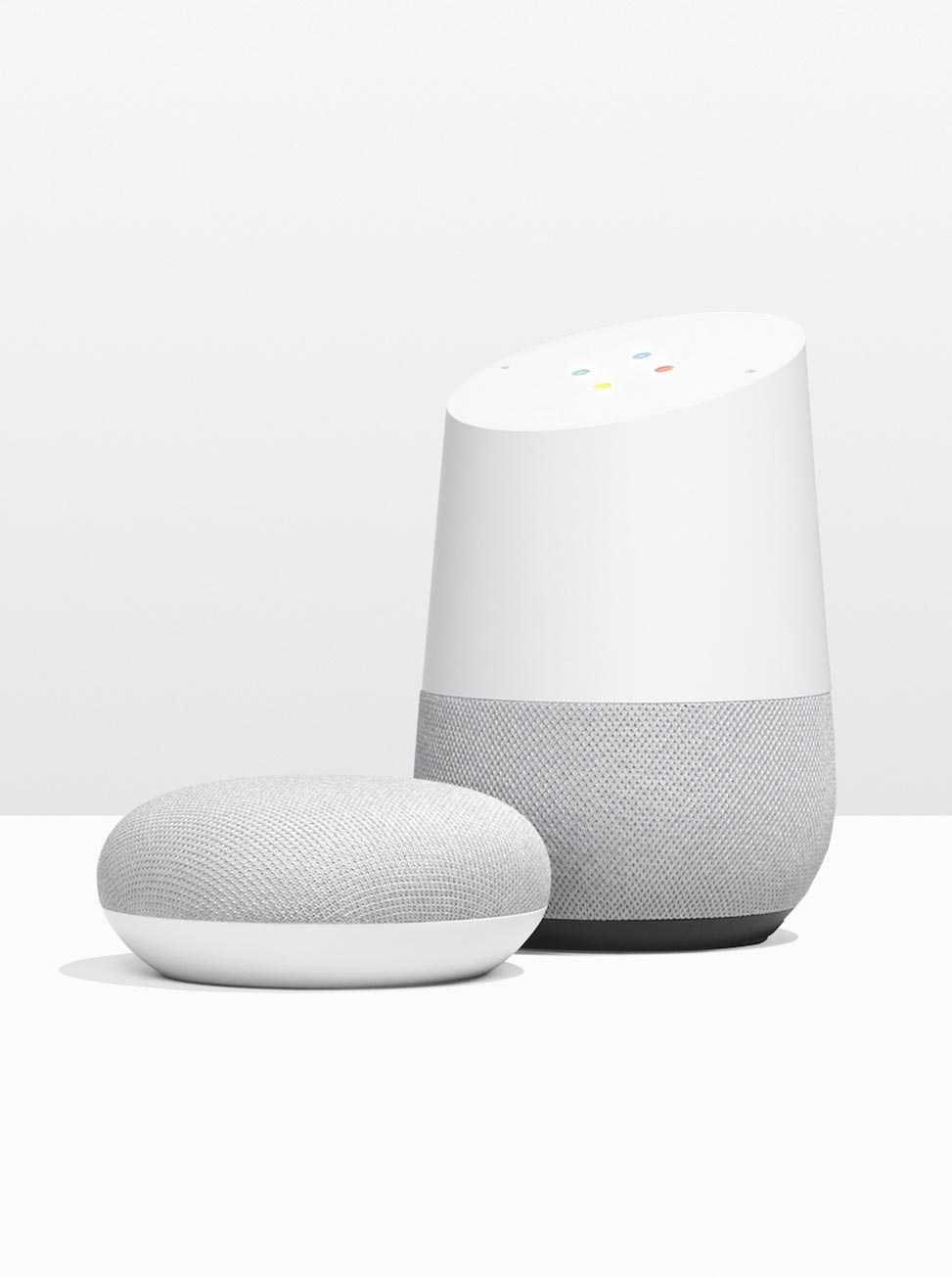
Google Home and Google Home Mini
My preference is towards the Home, and less the Home Mini, but both are scuptural and appreciated the role of decoration the speaker has. The matte white plastic combined with the fabic gives the Home’s a comforting appearance.
I own a Google Home Mini, but I would love to get a Google Home and display it prominently.
Apple HomePod
 Bottom line: The engineers ruled the roost.
Expectations are high when Apple enters a marketplace because they have a track record of designing things in a way that made all previous designs look silly. But that did not come true when they entered the smart speaker market. The design is on par with the best, but not a leap forward.
It was clear when I was researching the story that they were focusing on the acoustic experience and the engineering that went into it. I feel as if the engineers arranged the speakers, and the designers just skinned it. I think of that as typical for a Dell or a Samsung, but you would expect a more integrated solution from Apple.
Sonos One
I feel like the designers from silicon valley featured in the article knew something about Sonos: that they value blending into the environment. They shun the spotlight.
That is a fine choice, and they succeeded at that. This speaker could go anywhere in any style room and barely be noticed. Finding the speakers in their press photos is almost a game of Where’s Waldo?
But this is a bit of a lost opportunity. A smart speaker is different than a classic speaker because someone talks to it. While you do not need to face these speakers to use them, a lot of people address them with their body. They should have a presence.
Harmon Kardon Invoke
 Bottom line: They designed a piece of consumer electronics when everyone was designing a houseware.
Harman Kardon has a legacy of unique speakers designs with a lot of lateral thinking, which is why it is so surprising that they designed a speaker that looks very typical of a computer peripheral.
No judgment; I might have designed it this way depending on the direction from executives.
But the opportunity here was to design a nice home decoration that people would like to look at every day. This is design isn’t a feast fo


Leave a Reply