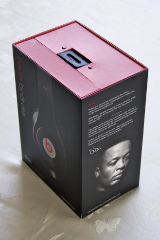
Awhile ago, two products entered my life in grand style. The two products have changed my life; I use them both independently nearly every day. The two products both greatly improved the experiences of the activities they facilitate. But most important for this blog post, the two products were excellently packaged.
The two products were the Monster Beats Studio headphones and the Kindle e-book reader (6″, Fourth Generation).
These are both very well designed products and are worthy of an entire blog post of praise for their industrial design. But that is not what I am going to talk about here. I was interested that the packaging experiences were so different, yet so effective in their own ways. Notice I say packaging experiences. The designers of these packages didn’t merely design packaging, but they designed the experience of un-boxing. But I talk about the packaging experience more in depth in another blog post.
To be clear: I did not design either of these pieces of packaging. I am expressing my great respect and praise for whoever designed these pieces.
The Kindle’s packaging and the Monster Beats packaging are very different. Clearly they have 2 different costs; the Beats packaging featuring alot of molded plastic and high end papers in order to reflect the premium nature of product it holds. The Kindle’s packaging also has molded plastic, but 1 piece and it is surrounded by raw (craft) corrugate. That corrugate highlights the next major difference, the channel. The Kindle’s packaging is wrapped in 1 colour printed raw corrugate because it gets to the customer through the mail. Even if they could invest in nice outer packaging, it would get dinged, scratched and battered in delivery. The Beats are delivered through the retail channel and are spared the rough treatment. But that also means that the packaging needs to looks like and convince customers on shelf beside it’s competitors. The Kindle’s packaging doesn’t need to compete for attention. Clearly the channel to the customer was a primary consideration in the design of each, and the difference in the 2 channels reflects the differences in the 2 packages.
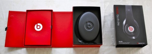
Even with the differences of the exteriors because of the channel, the interiors of both have similar considerations because the unboxing experience is important to both. Both make the packaging experience easy and have a clear sequence. Both products are easy to open. The Kindle has a tear away strip clearly highlighted on an angled front face. After you remove outer sleeve of the Monster Beats packaging, a magnets embedded in the laminated corrugate hold down the side you open first, which is highlighted by a fabric pull tab. Getting into the package is very easy in both cases.
Once you are in both of the packaging, they reveal the contents in a clear, decisive sequence. The product is the first thing you reveal in both. The door swings up on the Amazon packaging revealing the device, and on the Monster packaging, the packaging opens right to left, and the 3 sides of the compartment with the headphones which stays stationary and catches your eye first. In both cases, the product is revealed; much like a magician reveals the end of his trick. You don’t watch the silk sheet being pulled away, your eye is fixed on the dove now in cage. I do have a criticism for Monster on this. The expensive headphones are zipped up in a carrying case, adding one more step to the packaging experience and lessening the reveal. The carrying case is a nice value add, but shouldn’t get in the way of the customers first experience with the product. Instead of a moulded foam case, maybe they could have a collapsible case that can be held under the product. The Kindle is presented face up, centred in a moulded paper tray. Simple, tidy and focuses on the core product.
The other piece being revealed in the sequence is the information booklets, cords and other peripherals. Both the Kindle and the Beats use the door that revels the product to hold the manuals. They both cover them up to hold them in, but also to make sure the product is the focus in the reveal. The Kindle packaging has compartment for the manual in the moulded paper that protects the product. A nice duel use. The Beats has it in a box with a door held down by a velcro dot and highlighted with a fabric pull tab. The Beats has it with the cords, batteries and adapters, where the Kindle puts the cord in another part, under the product. In both cases, the cords and peripherals don’t distract from the core product.
The differences and similarities of these two products show the thoughtfulness that was given the packaging in both cases. They do a great job by considering four things: 1) the delivery channel to the customers, 2) the ease of getting in the packing, 4) the presentation of the core product, and 4) the sequence of the reveal of the core product before the peripherals. If everyone considered these things when designing or sourcing their packaging, we would have a lot better user experiences by getting off on the right foot.


