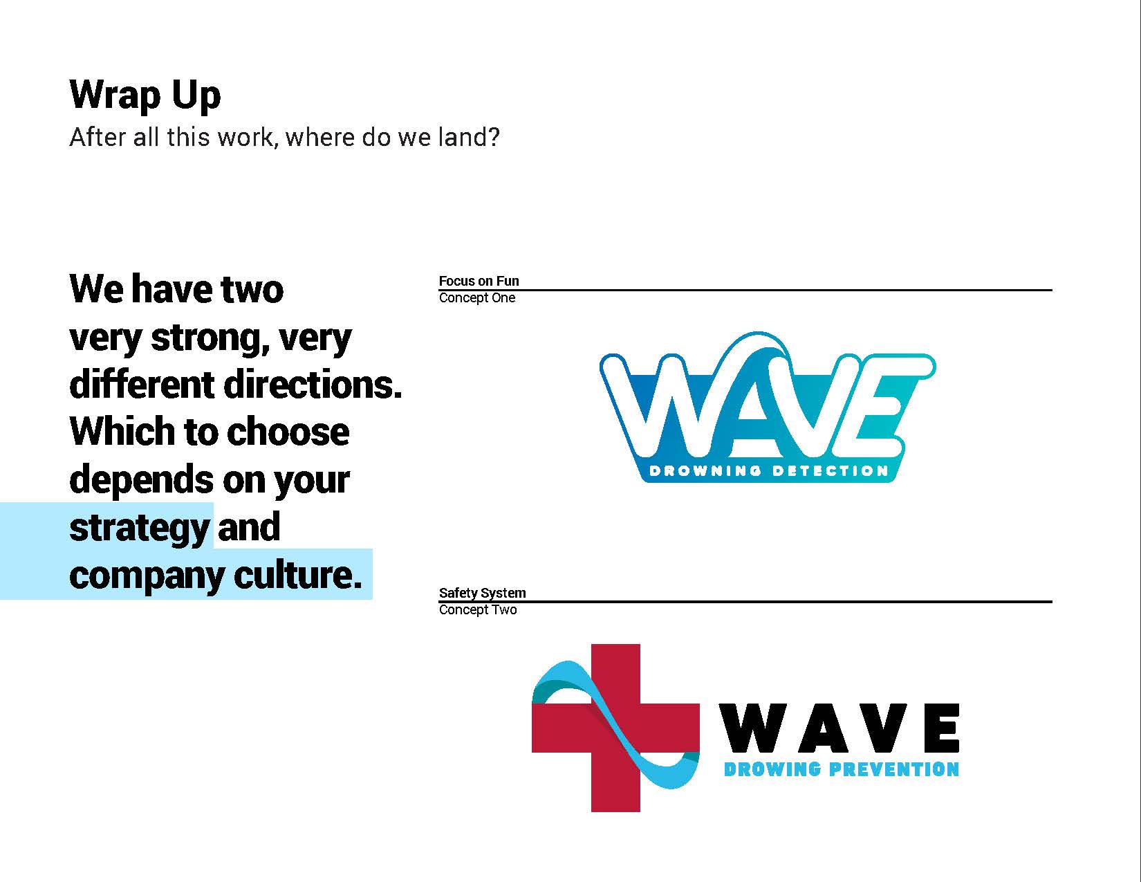
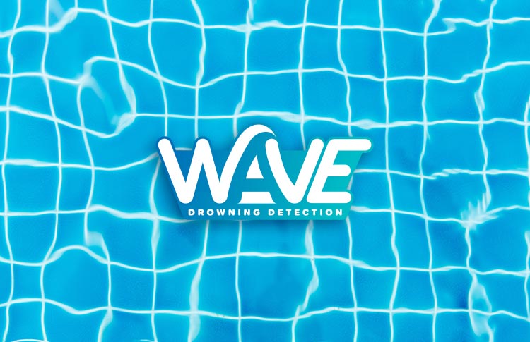
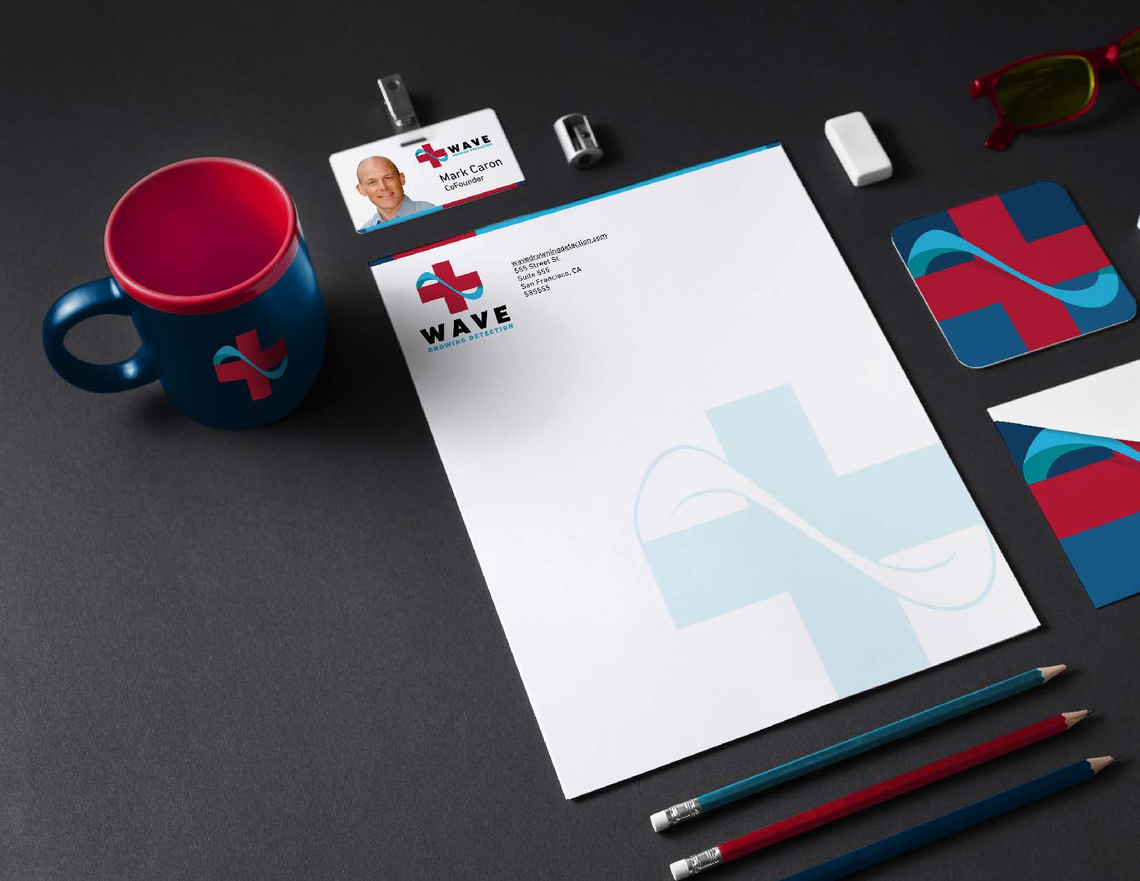
A logo and brand identity for a company with a critical mission: saving kids and adults from drowning.
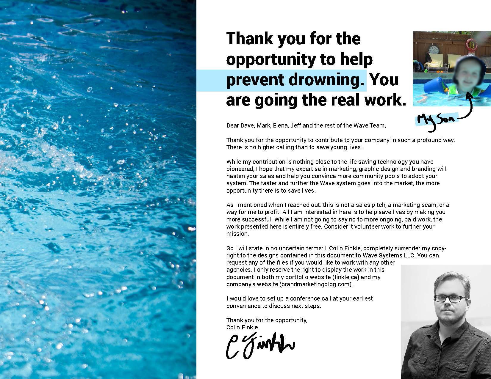
I can remember when I heard of WAVE like it was yesterday. It was a few years ago, and I was in the middle of the two-hour drive to my grandmother’s house, and my son was dead asleep in his car seat in the back. It was raining like mad.
I was listening to podcasts, which usually are light and make the drive seem quicker, but the episode of This Week in Startups turned heavy. Mark Caron, CEO and co-founder of WAVE, described how easily, needlessly, and tragically people drown in pools, lakes, and oceans right in front of the eyes of lifeguards.
I looked back at my little son and thought of losing him to drowning, and it brought me to tears.
I needed to do something to help out. The WAVE team had a working prototype of a product that would detect how long someone was underwater, and the industrial design was excellent. I knew I could use my talents as a brand marketer and designer to align their company’s look with the seriousness of their mission and the quality of their technology.
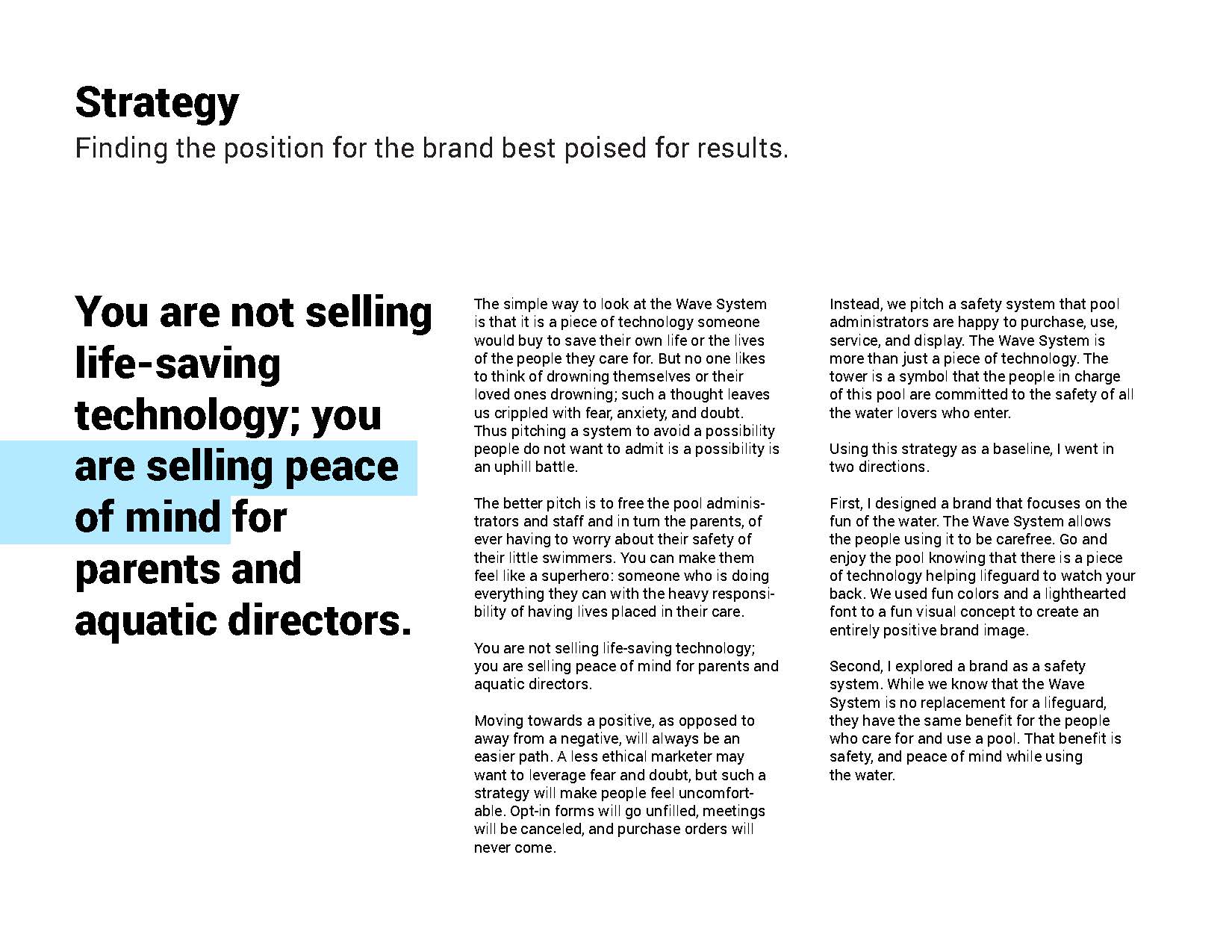
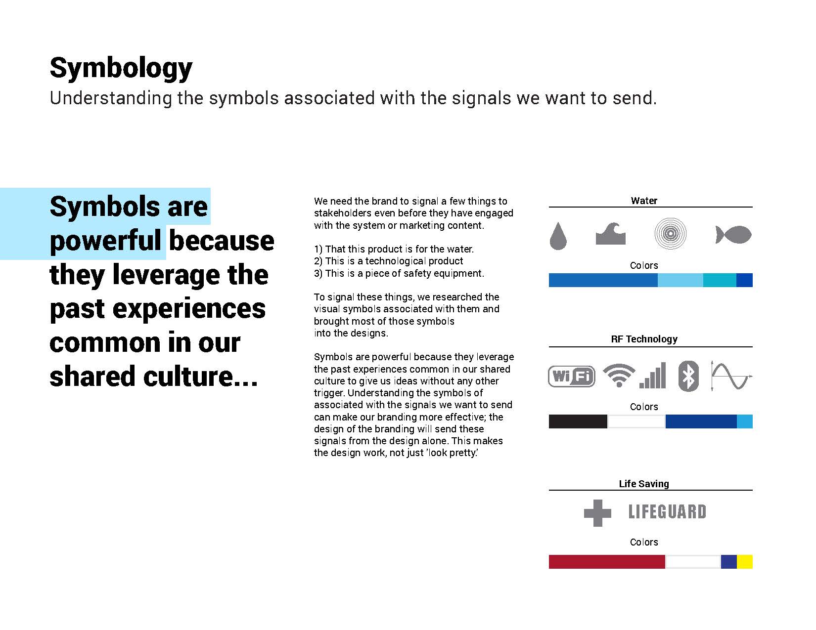
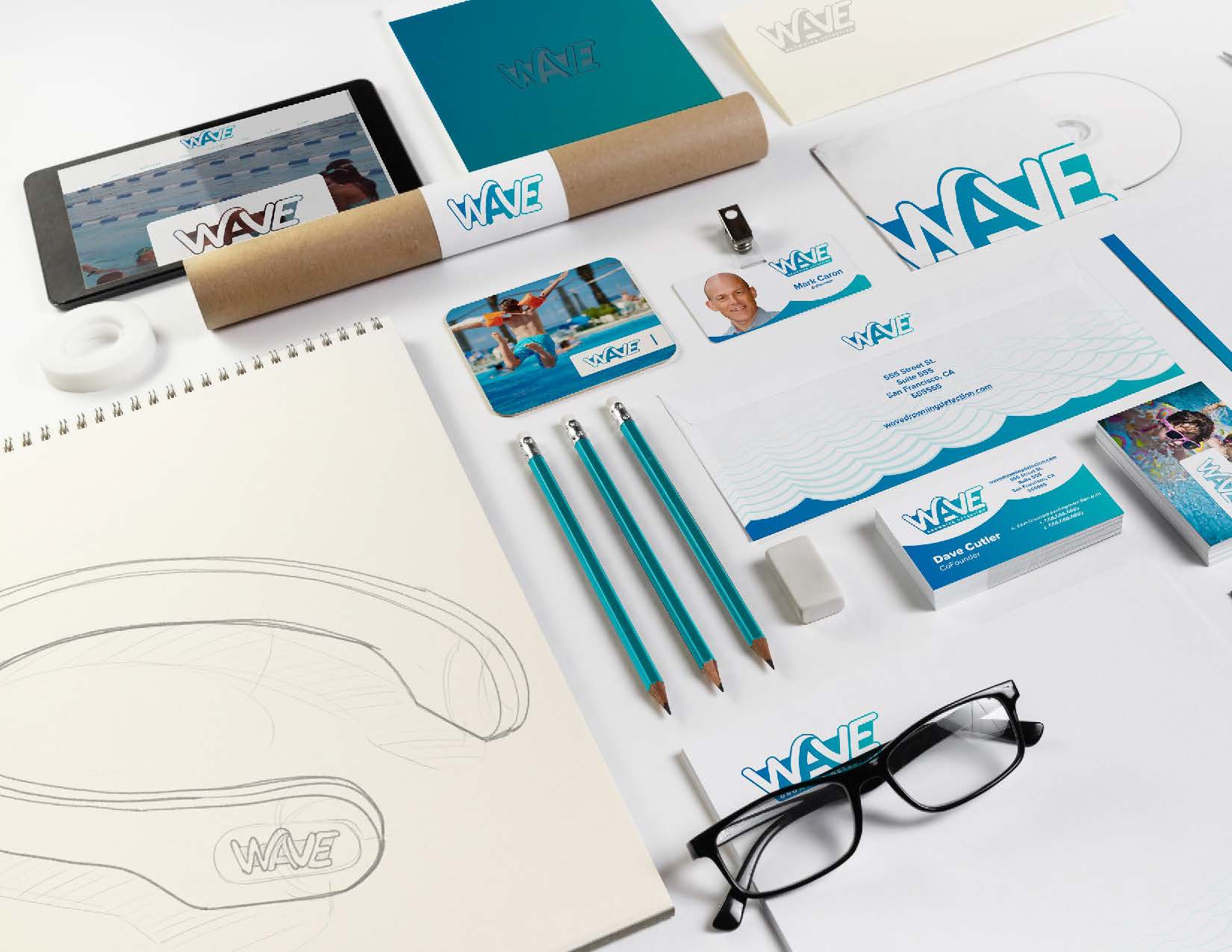
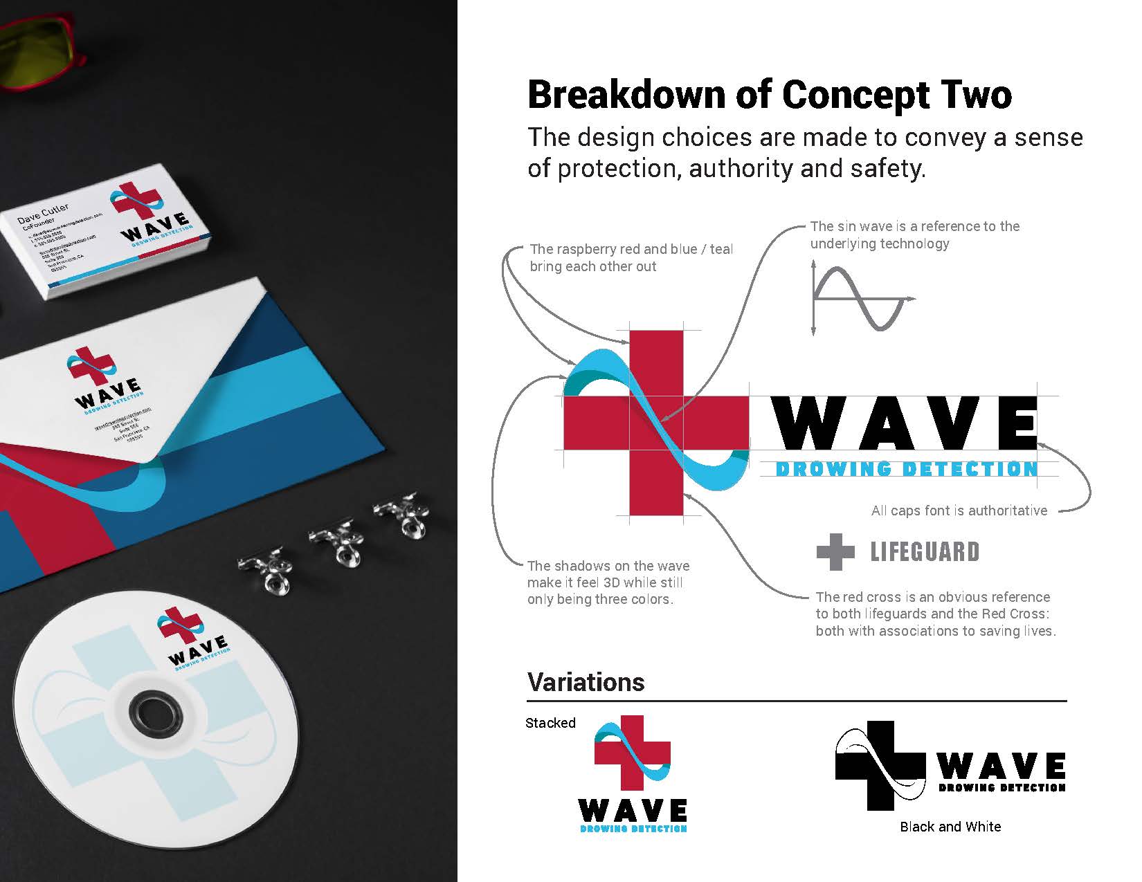
I reached out to them to see if they would be open to such volunteer work, and they were. I researched the iconography of water, radio-frequency (RF) technology, and lifesaving. I designed and presented two concepts, which you can see here:
Unfortunately, they chose to maintain their current branding and dedicate their time and resources to getting the product in the market. I respect that.
Hopefully, I brought a new perspective to what they were doing and shaped the view of their brand just a bit. I hope I furthered their mission in some small way.
Wave Logo and Branding Concepts
Background and Research for Rebranding
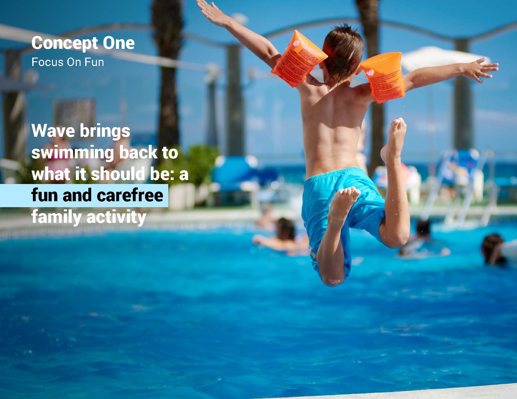
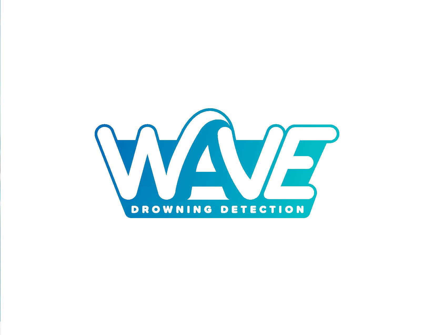
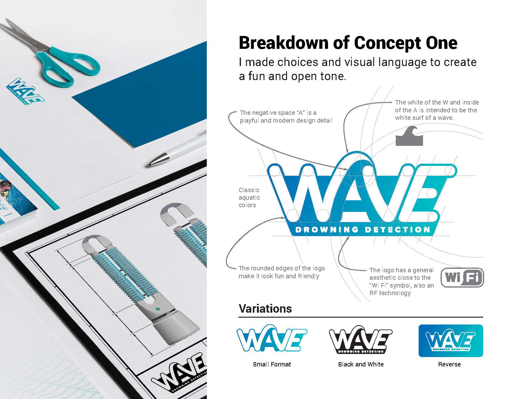
Logo Concept 1 – Focus on Fun
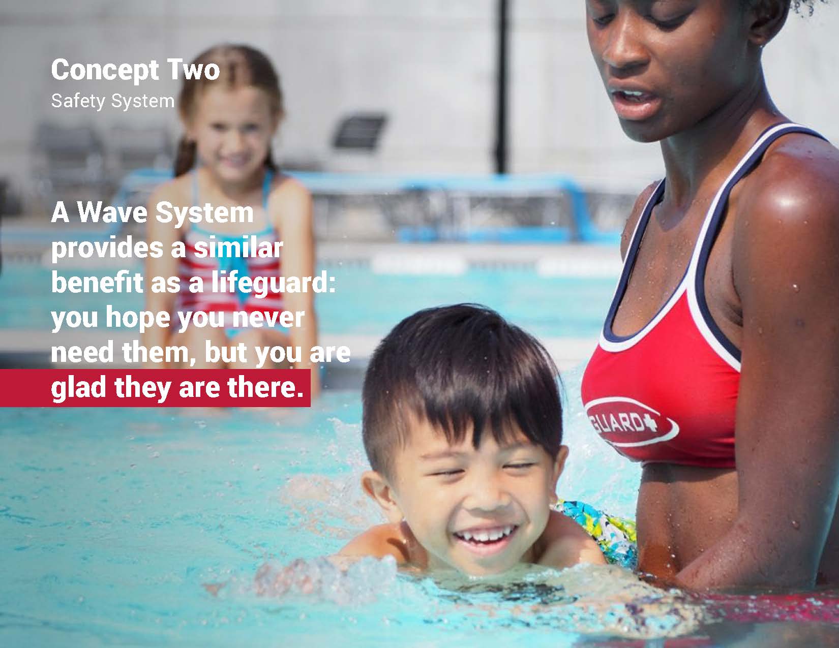
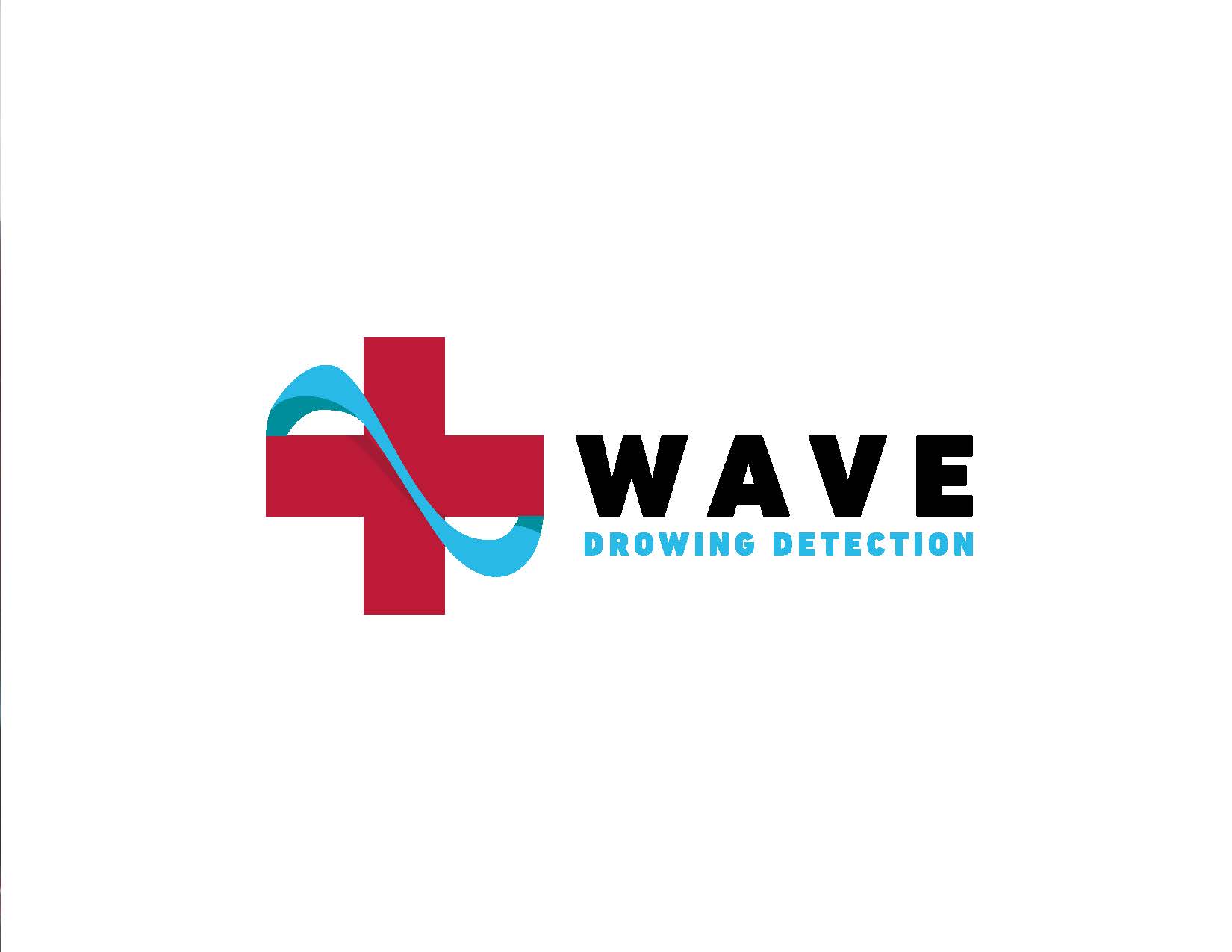
Logo Concept 2 – Safety System
Conclusion
