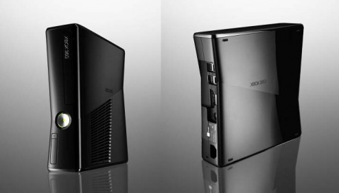
Microsoft unveiled their new Xbox design at the 2010 E3 (Electronic Entertainment Expo), the gaming convention. The new hardware is packed with a 250 GB drive, and Wifi (a long time coming.) But what I want to focus on is what is on the outside. The old design was done by the industrial design / branding firm Astro Studios; a firm I am a fan of and take inspiration from. I don’t know if they deigned this case as well. Let’s analyze the industrial design:
– This is clearly is under the same line of thinking as the Alienware hardware. Nothing wrong with that, particularly because Astro also did the design for Alienware. This is a strong difference from the pervious Xbox which was tidy and refined. The new design is more Mitsubishi Evo if the old design was an Audi.
– Speaking of cars, the case design is like a car in that it has a belt line. A belt line design element on a car is the corner on the side that divides the sheetmetal pointing down from the metal pointed up; because above the belt line is reflecting the blight sky and below is reflecting the dim ground, it creates a high contrast line that can be used graphically on cars. This only works on shiny exteriors particularly using black, which the new Xbox case features. The line angles up to the back, and creates a nice graphic appeal to the otherwise boring side the the case. The fins and shape of the air intake on the right side reference the belt line, creating a dynamic yet tidy appearance.
– The logo debossed on the sides of the case look too small, and out of place. On the right side it references the air intake, but on the left side there is nothing anchoring it to where it is positioned. It as a straight horizontal element looks awkward so close to the angles belt line. I would eliminate the logo altogether, or move it to the bottom or the top to reference horizontal lines.
– The chrome button looks striking against the graphite colour of the case. But the brightness of the button drowns out the signature green-yellow glow around it. Maybe the glow is more prominant when you see the unit in person. I would like to have seen the green glow in more places, as it is the basis of the Xbox branding. It would have been nice to see the logo on the front of the case lit up.
– The choice to switch from a light gray ro a grapite black is an interesting. They have had a black case before with the Xbox Elite, which was also a funny choice. With the original design, I credited Astro for have a very strong link between the branding and the case design. This black distances the branding and the product. It also moves it towards the look of their principle rival, the Playstation 3. This was change probably driven to distinctly distinguish the new model from the old one for marketing purposes.
– The awkward hump on the top of the old case is eliminated… hallelujah. Let’s hope the overheating and red ring of death problems are gone as well.
– The unit looks like it can still stand or sit on it’s side again. A nice feature to have. As nice as it would be to have people proudly display this in their living room standing up, I imagine it will be used on it’s side 90% of the time.
– The case overall looks like they have designed some cost out of it, with only 1 finnish, has shallower injection molded parts and eliminated some parts. This is a good example of how a tidy, inexpensive design can look better if you understand your restraints and design a nice visual concept around them.

