People were having a tough time with the peripheral products for their HDTV: HDMI cable vs. composite cables, fixed wall mount vs. floating wall mount, gold plated this, superior quality that. It was a lot for the customer to make their decision, and Walmart was loosing sales to more high-touch electronics retailers.
Walmart asked Philips to take a fresh look at the section and Philips asked us at Matrix Marketing to design it for them.
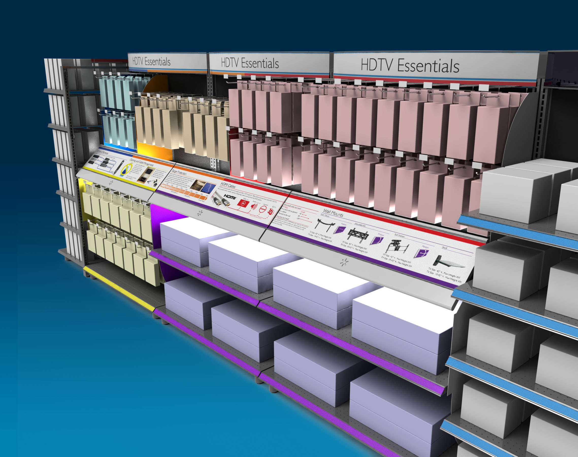
First and foremost for me when designing a store section is to visually guide customers to the product category they are after, and the most effective way to do that is to break it up with colour. (You can see how I did that in the Avent section in BRU.) Philips outlined that education about the product was something they wanted to see, but had initially envisioned posters. I took inspiration from museums, and put in an angled panel that would allow me much more depth and breadth of information, and would be a much more pleasing learning experience than reading a poster. This angled panel also allowed me to waterfall the product, and add some lighting to generate interest.
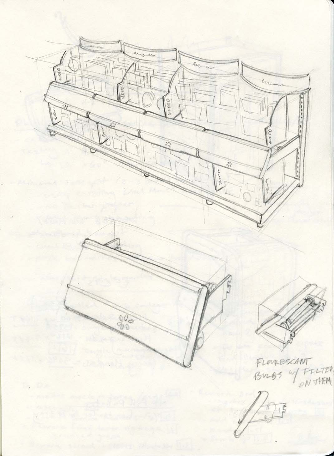
For a bit of process, see my initial concept sketch straight out of my Moleskine notebook below.

© 2011 matrix marketing concepts inc. All rights reserved.

